
Movie Inspiration - Wes Anderson's "The Life Aquatic"
Monday, February 23, 2009
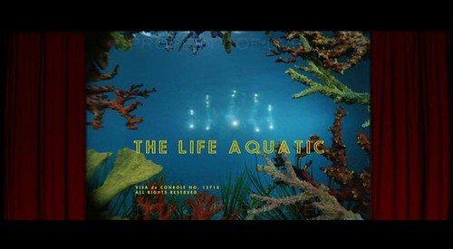
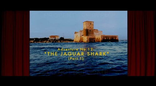
I really like the type they used for this movie
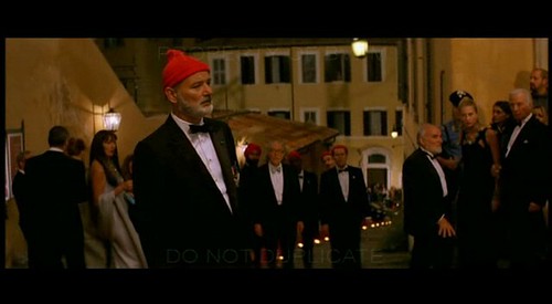
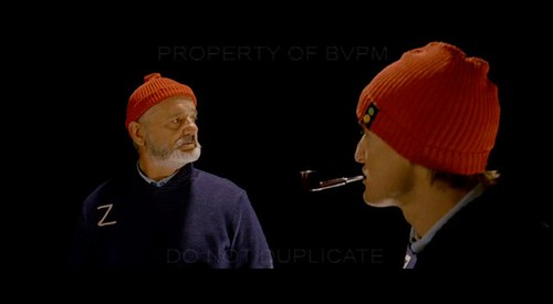
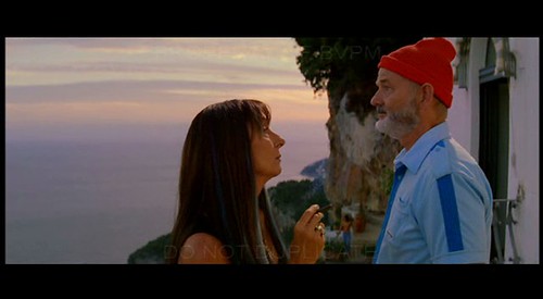
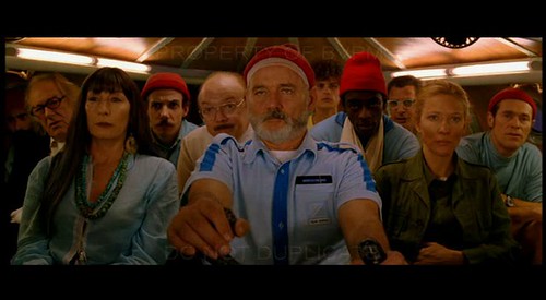
the matching red caps throughout the movie make nice warms spots.
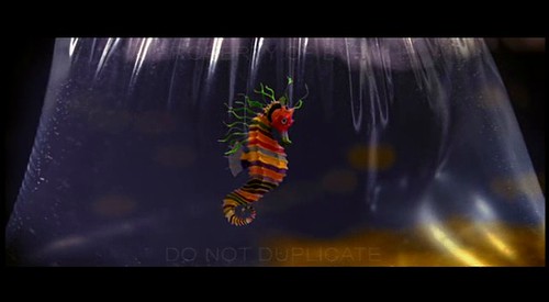
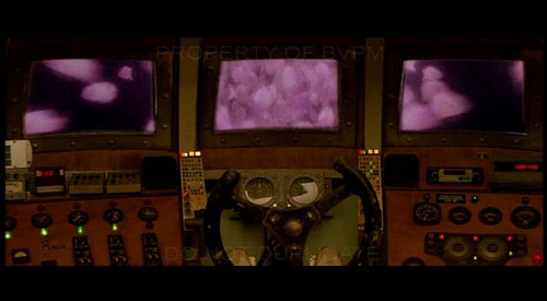
they used some technique like claymation to animate the sea creatures.
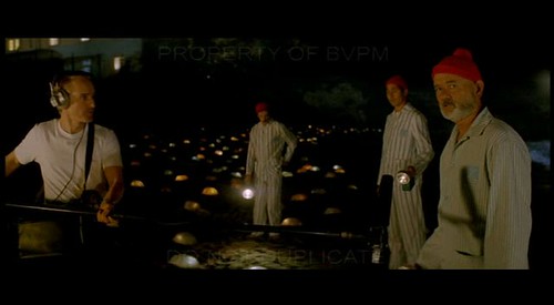
the matching pajamas and outfits throughout the movie are a hoot but also and artistic decision by Anderson that is great visually
check out the colors in the interior schenes. He has his interiors painted they way he wants them. I use analogous color schemes and so does Anderson so I am drawn to his interiors.
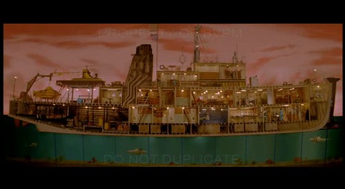
The cut away scene of this boat and other scenes is very fun and visually fresh
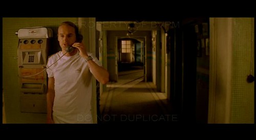
composition! I wish all the illustration assignments I got were widescreen
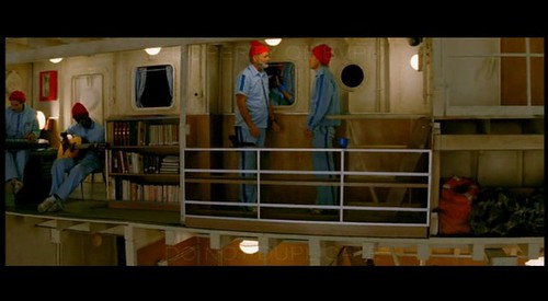
cutaway shot
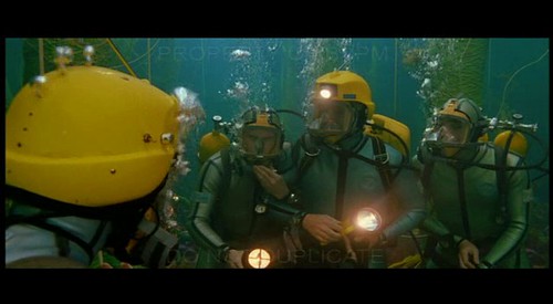
When I was trying to do Children's books one thing people would say sometimes is make sure you have a variety of close ups, medium range, and pulled away compositions in your book. Anderson does a bang up job at this
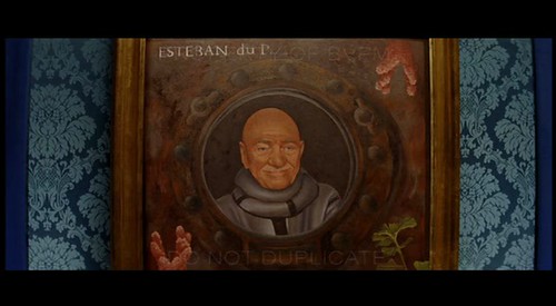
how awesome would it be to be the artist that painted the portraits in this movie?
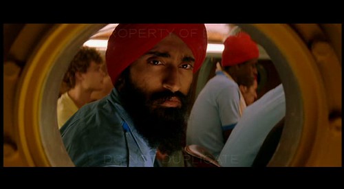
even gave him a red turban, which of course once you see it you realize that you wouldn't want it any other way
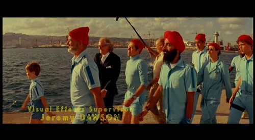
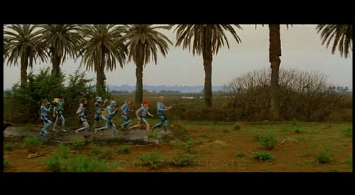
the matching baby blue uniforms and red caps are a signature from this movie and really sum it up visually. I can't wait to see what Wes Anderson is working on next, I think it is the Fantastic Mr. Fox, a Raold Dahl book
Posted byJason Raish at 6:43 AM 0 comments
Labels: Movie Inspiration
Dailies contact lens game for Saatchi and Saatchi NY
Monday, February 16, 2009
www.dailies.com

Posted byJason Raish at 4:27 AM 3 comments
Mojo magazine Illustration
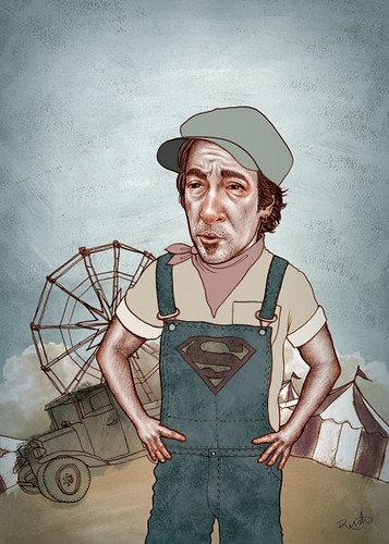
This was for Mojo, a British music magazine. It was a full page for a review of Bruce Springsteen's new album, Working on a Dream. they liked it and said it was working class bruce and wanted him as a dusty old hero that he has always been. there is a song on there called carnival which is why they wanted that background. Cool to do british stuff but sad i'll never see it.
Posted byJason Raish at 3:51 AM 0 comments
Chinese New Year Art "Nian Hua'r"
Tuesday, February 10, 2009
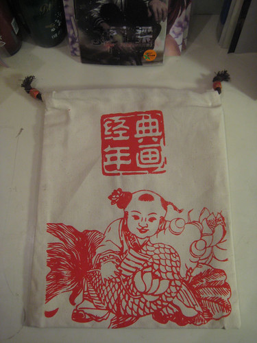
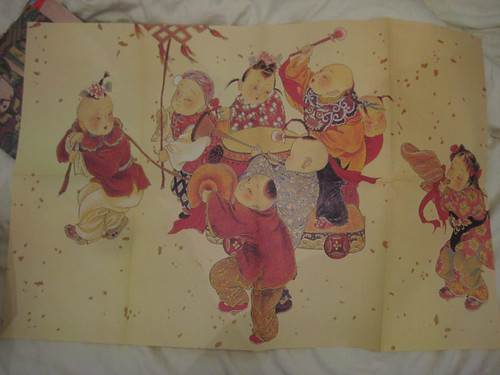
Art specifically to buy during chinese new year. at the Ditan Park Temple fair my friend Zizzo really wanted to buy what was in these bags, i had no idea what it was he just said if we all buy 4 total they will give it to us cheaper so i said ok. each bag ended up being 25 rmb. I didn't get to see what was inside until the week later and boy was I pleasantly surprised!
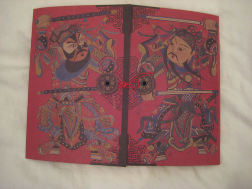
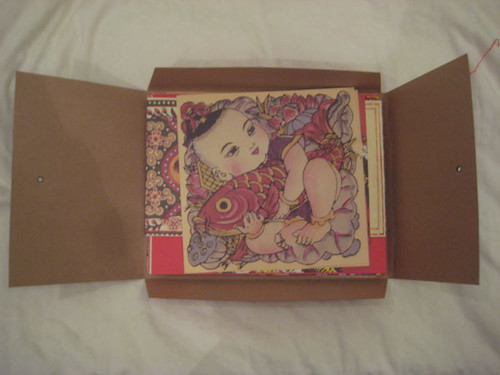
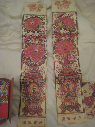
It turns out that it is "Nian Hua'r", Chinese/Lunar New Year Art. This whole package is pretty cool starting with the screen printed bag and next this "doorway" container.
these go on the sides of your door
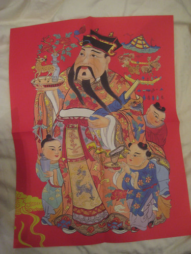
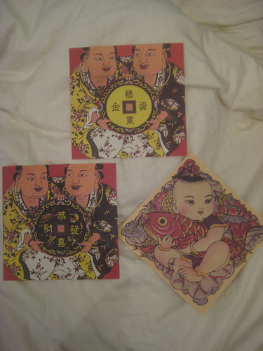
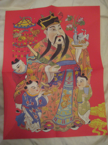
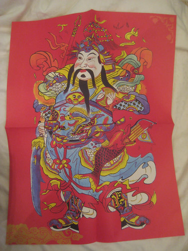
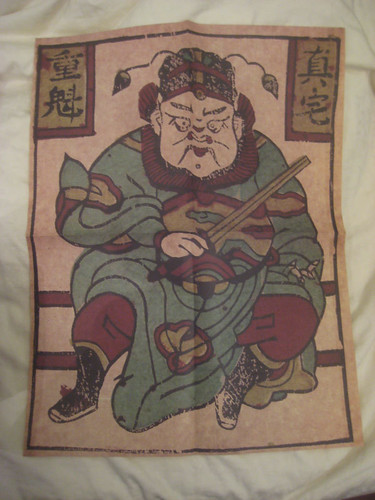
these 4 guys with the red backgrounds are the 4 big gods of Chinese Buddhism, they don't have them in tibetian or other buddism. All this info is coming from Angel who is a wealth of information when it comes to this kind of stuff
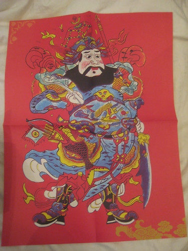
This is the Ghost catcher god. Angel says there are usually captured ghosts under his feet
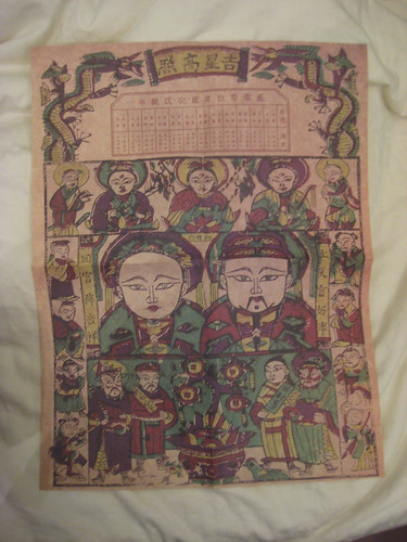
at the top of this thing is the old school 24 period calendar instead of 12 months.
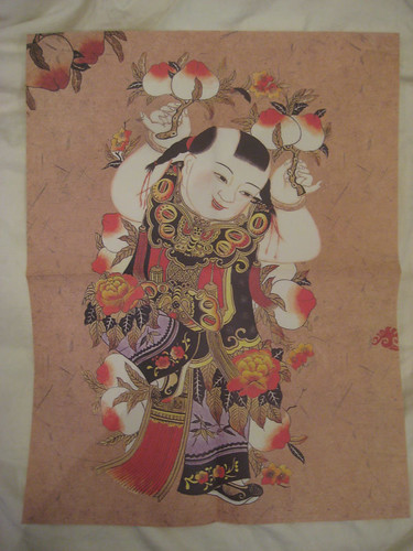
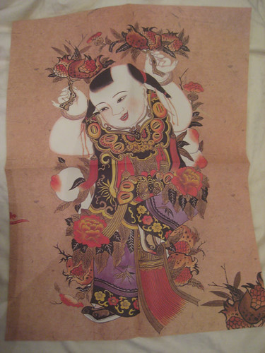
don't know who these guys are but this guy is holding "longevity peaches" which are probably good to eat in the new year or something. Also my friend Jia jia calls me a longevity peach when i drink because i get rosy red and i have a huge head
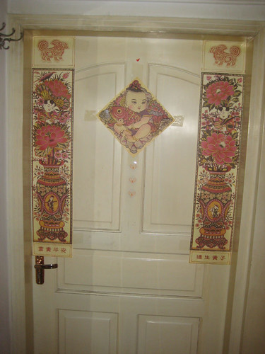
here it is in action on my roomates door.
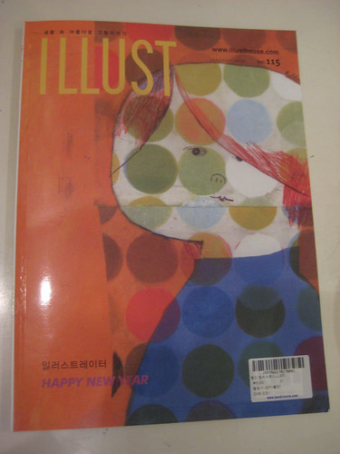
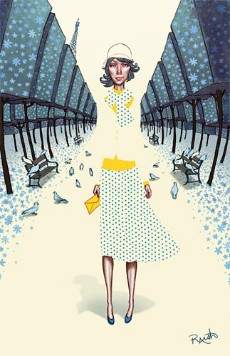
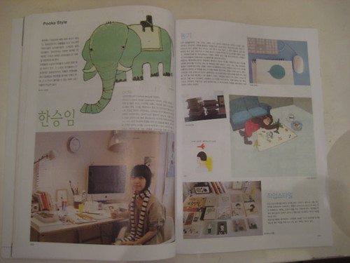
Illustration Magazine i got in Korea
Posted byJason Raish at 2:12 PM 0 comments
China National Gallery Part 1
Thursday, February 05, 2009
I went to to go buy art supplies. All the stores in Beijing are pretty much across the street from the China National Gallery. I was meeting Angel and was late so she went to the museum. I had a deadline but I still had never gone and it's a shame so i said whatever I'm gonna go. And boy was I pleasantly surprised. Not only are there tons of awesome chinese painters from the "western school of painting" there of course were awesome chinese paintings as well. theres a lot so here is is in 2 parts.
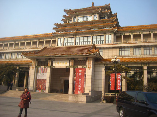
directly across the street from here is where all the art stores in Beijing are. Also this is where My Aunt pointed out this tall skinny beautiful bohemian artist looking woman and bob took a picture of her and his flash went off and she turned around and stormed over to him and demanded he delete it in perfect english. hahahaah
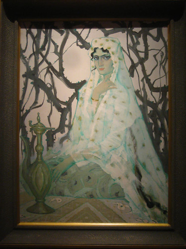
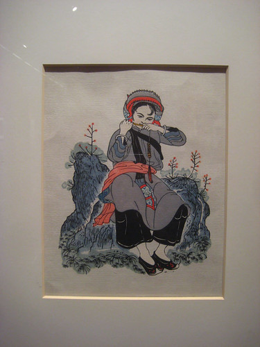
my camera is so suck. it can't capture the correct colors and has wicked barreling so 4 ft paintings are warped, look at the frames.
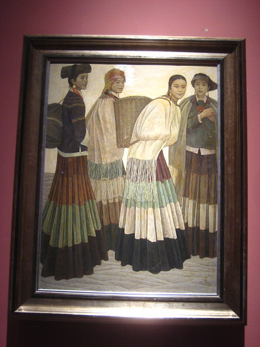
all of these were from what seemed like the western style floor. now what famous american illustrator does this look like?

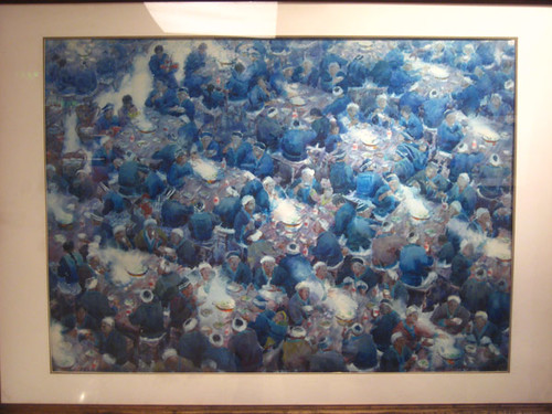
amazing blues ruined by my camera
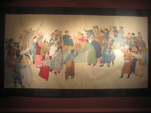
in the middle is mao. on the right is deng xiao ping Angel thinks. i guess the close up i took will be in the second part, oops. Anyway Angel says she hates mao but that he is still a "great man". i said what! and she said yea he is one of the men who really changed history. we both agreed changed for the worse but she also said he was a great poet and a few other things as well making me think that she and other young people still think it was somewhat good/important/not a total jerk.
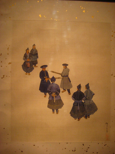
crazy water color
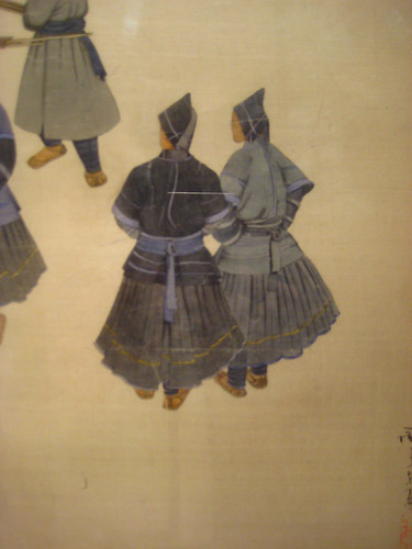
crazy fold details in this traditional painting.
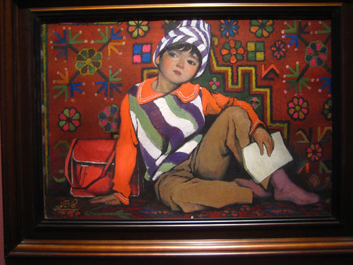
doesn't this look like one of these female illustrators style, like Jessie Wilcox Smith i'm thinking maybe?
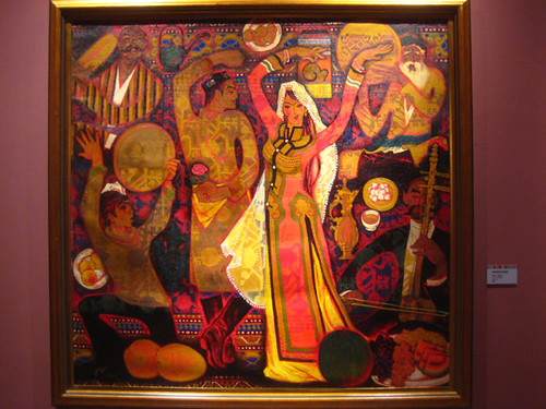
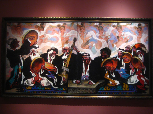
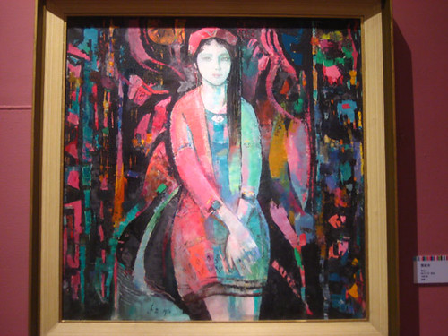
Angel didn't notice the wall of topless and unrealistically endowed women dancing in the background but that is the first thing i noticed! this is in Xinjian province, the Muslim minority province in western china.
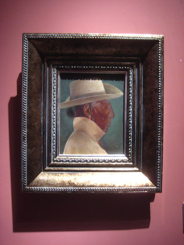
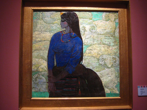
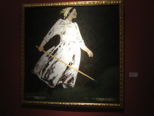
this was a smaller painting, and this frame accented it so well! and then my camera destroyed that nice little harmony.
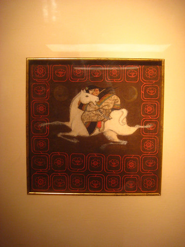
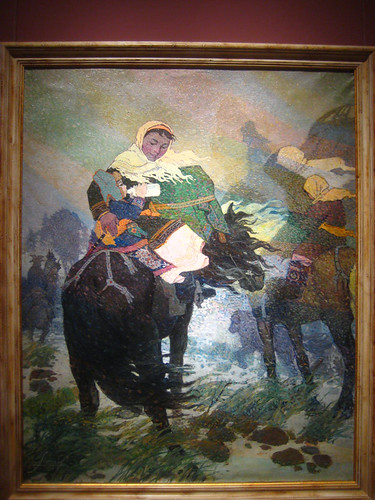
i need to start getting the paint out again. look at those horses legs!
Posted byJason Raish at 6:52 AM 0 comments


