Communication Arts 51 Winner!
Wednesday, March 17, 2010
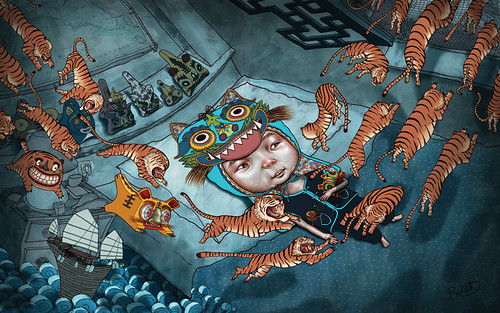
This was for Tiger Beer. They invited me to be a part of their "Tiger Translate" artist series that they have every so often. It is the biggest physical size i've ever done. it's 3 feet by 2 feet. Printed out this is a beaut. This year's tiger translate theme Change/Society. This piece is about losing culture. Here is my little statement: "Since I’ve been living in China I have been attracted to tiger hats and tiger toys for children because these representations of tigers are very different than western interpretations. In Chinese culture the tiger hat is meant to protect children from evil spirits and other bad things. I thought the tiger hat would be perfect for this concept because it is supposed to protect the boy yet it needs the boy to protect it from becoming another forgotten tradition. This made me think about how culture is always changing resulting in old traditions being lost. As an artist I am saddened by the loss of visual culture, such as these tiger hats. The orange tigers represent some of the ways culture is lost. A lot of my friends' immigrant parents withheld their culture from their children to westernize the children thinking it would give them a better life. Some people reject their culture or it could be forcibly taken and outlawed. It could be bastardized, commercialized or watered down. These are represented by different tigers in this illustration. Behind it all this piece has a positive message. The hat is a cultural icon that you can physically see but it also represents the boy's culture as a whole, a symbol of what he needs to protect. It's tied firmly to his head, giving us hope that he will be one of the few that preserves his cultural heritage."
I'm working on 3 more of these to make a nice series. they take a long time so we'll see how far i get into this. I brainstormed on this piece for weeks so i had some other really good concepts that I wanted to do as well.
Posted byJason Raish at 12:38 AM 0 comments
Comps for BM Savings
Tuesday, March 09, 2010
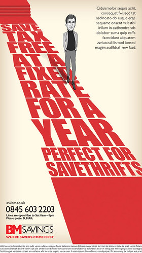
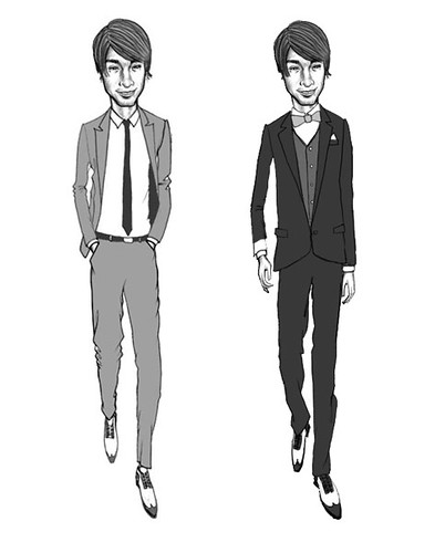
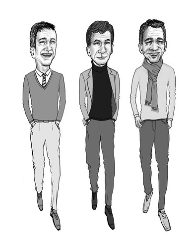
These were black and white comps done for BM Savings in the UK. They were done Via DLKW, and agency in London. After they first round they came back and said they wanted to commision a new set of comps with older guys, 30, 40, and 50 yrs old, dressed more smart casual rather than slick suits. I never heard the results even after asking. I looked today and saw that they ended up going with the agency's comp which was exactly the same red carpet background with a black clipart silhouette of a guy walking. How sad. Thus is the world of advertising. Thanks Marion for calling me though.
Posted byJason Raish at 5:33 AM 2 comments
Even More new 2010 work
Monday, March 01, 2010
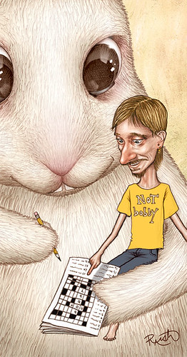
spot for the Radio Times in the UK for a play called "Not Bobby". its about a mum and her son and a rabbit that he brings home that can complete crossword puzzles. the son is played by Mackenzie Crook (The Office, UK version). i am glad the art director went with my crazy off the wall idea with the giant rabbit.
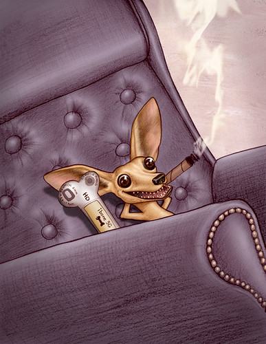
spot illo for Network world about becoming a data center top dog.
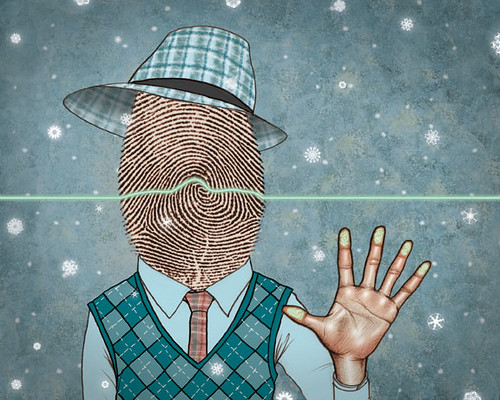
Posted byJason Raish at 12:18 PM 0 comments
More New Work in 2010
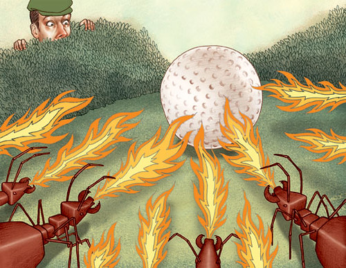
spot for the monthly rules guy column about the ball landing in a pile of fire ants
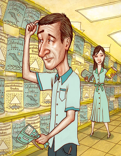
full page for Risk magazine in the UK. about exciting things like collateralised trade and uncollateralised trade. With an S no less.

a full page for Airtran Go magazine that you find in the back of the seats on Air Tran flights. this was about how st. louis is a man's city filled with steak houses, barber shops, go kart racing, and was the stomping ground for Lincoln and john Dillinger the gangster.
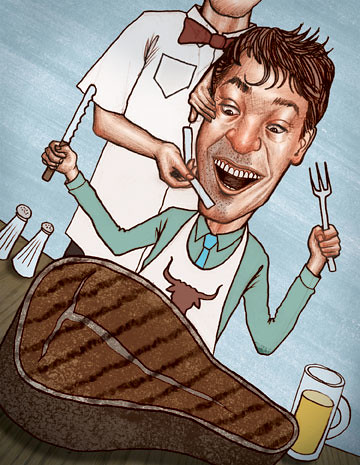
spot for the same St. Louis is a man's city story.
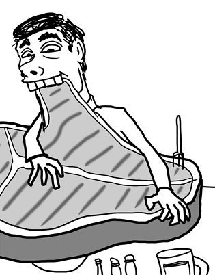
this is the sketch i wish they had gone with.
and Chris if you see this can you post the other new post with the giant rabbit instead of these illos? thanks!
Posted byJason Raish at 11:57 AM 1 comments

